

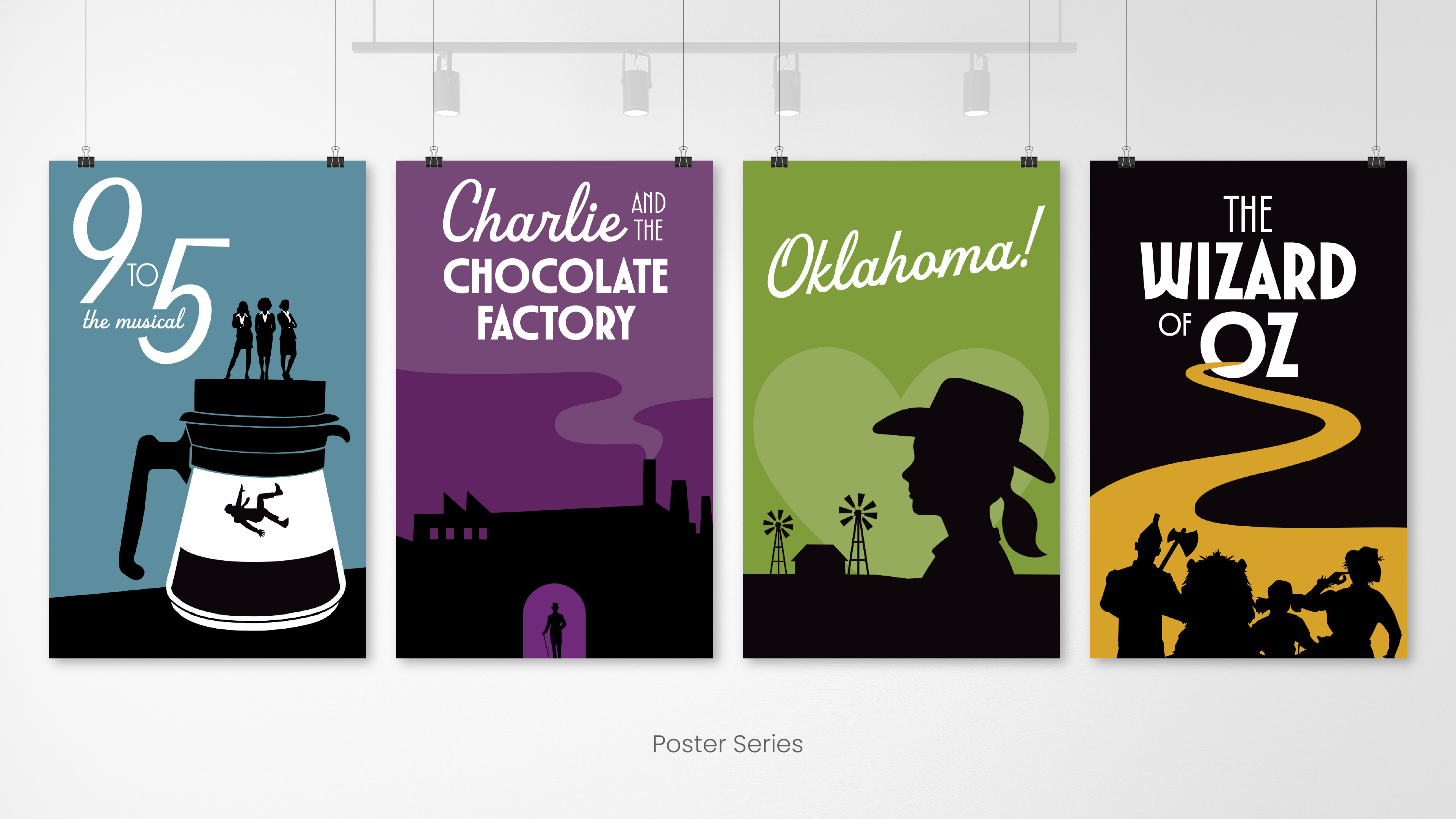
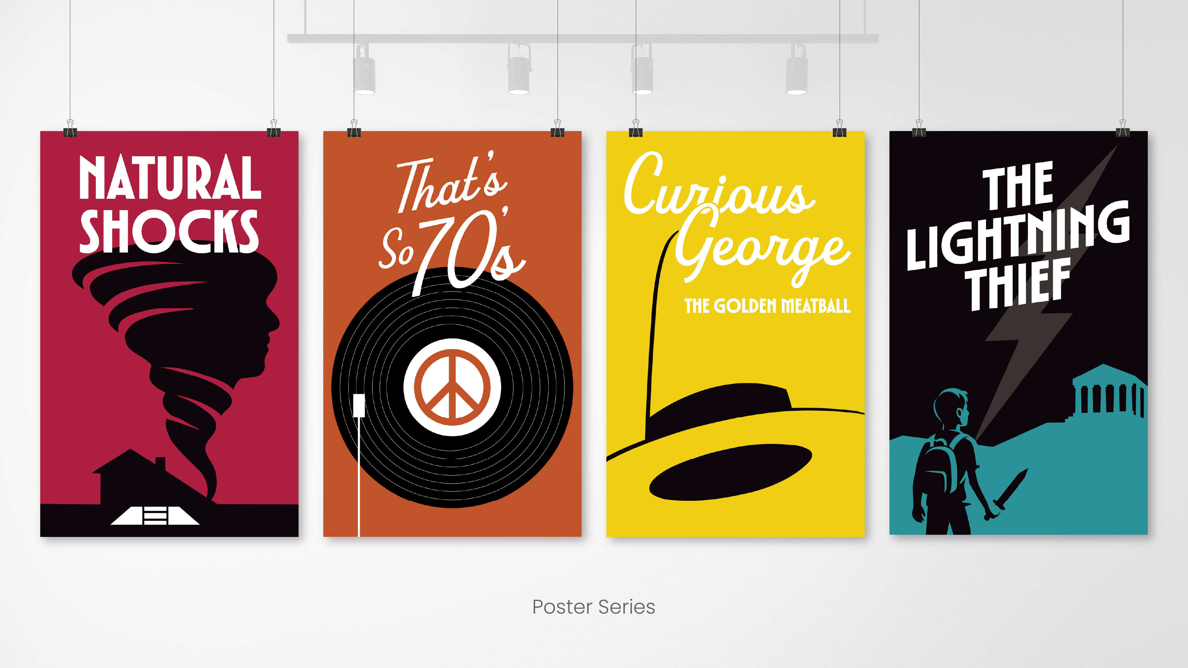
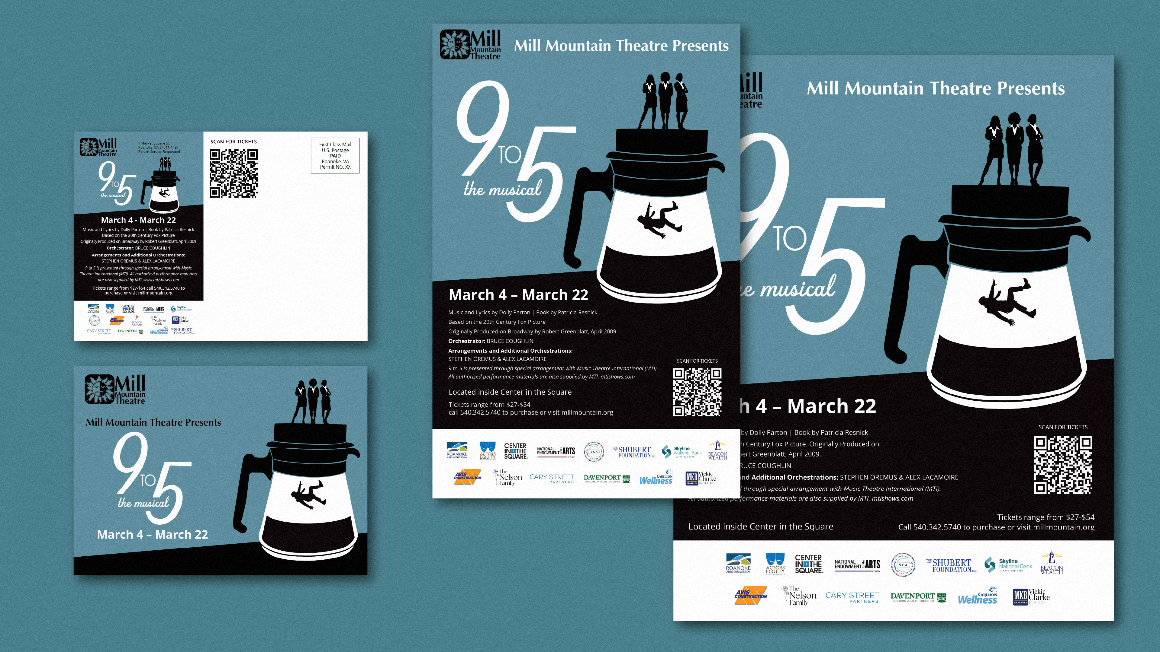
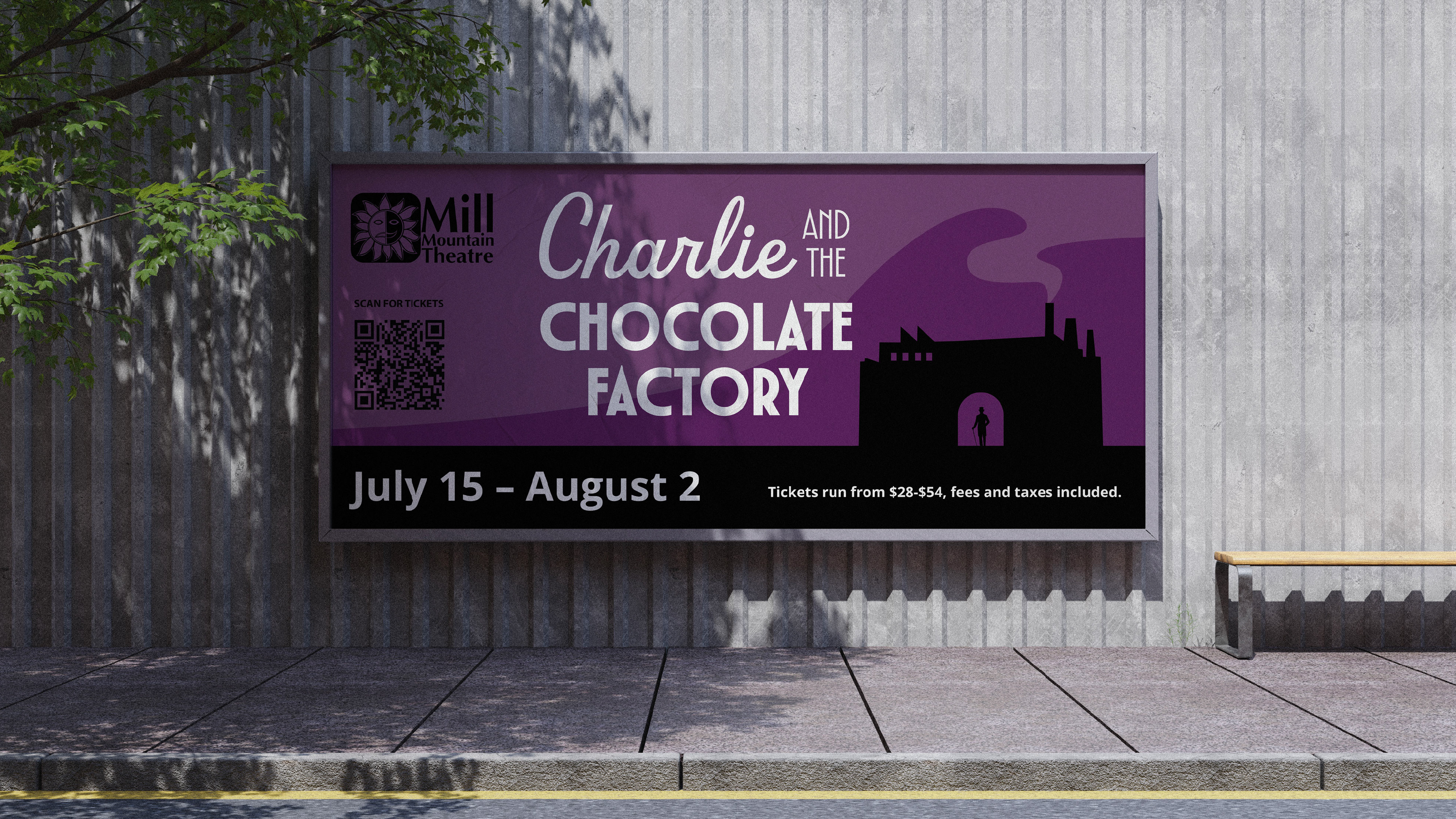
The Problem: Mill Mountain's past poster series did not have a unified look and feel, each poster feeling disjointed from the next. The client wanted a look that felt more elevated and something that when you saw it in a shop window, you'd know who would be putting it on.
The Solution: A cohesive illustration style, utilizing high contrast flat illustrations paired with a limited color palette. As well as a typographic system that despite using only two font families, still feels specific to each show's theme.
The Solution: A cohesive illustration style, utilizing high contrast flat illustrations paired with a limited color palette. As well as a typographic system that despite using only two font families, still feels specific to each show's theme.
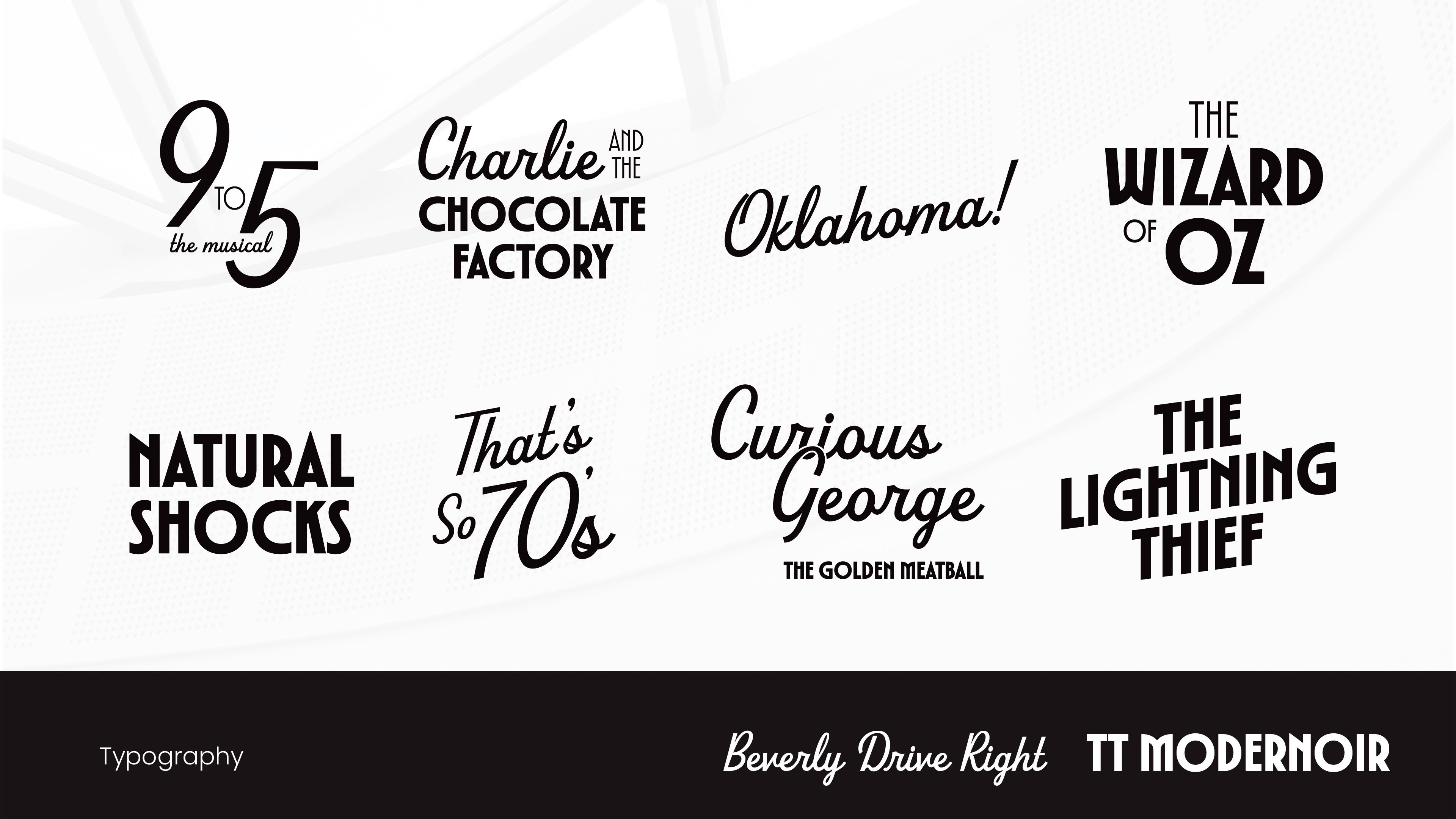
The Typography Solution: A typographic system that hinges on two main fonts that can be paired together in endlessly expressive combinations. Each musical's title needs to feel unique
while still aligned with the content of the show. The finished poster series aims to balance this cohesiveness with creativity.
while still aligned with the content of the show. The finished poster series aims to balance this cohesiveness with creativity.
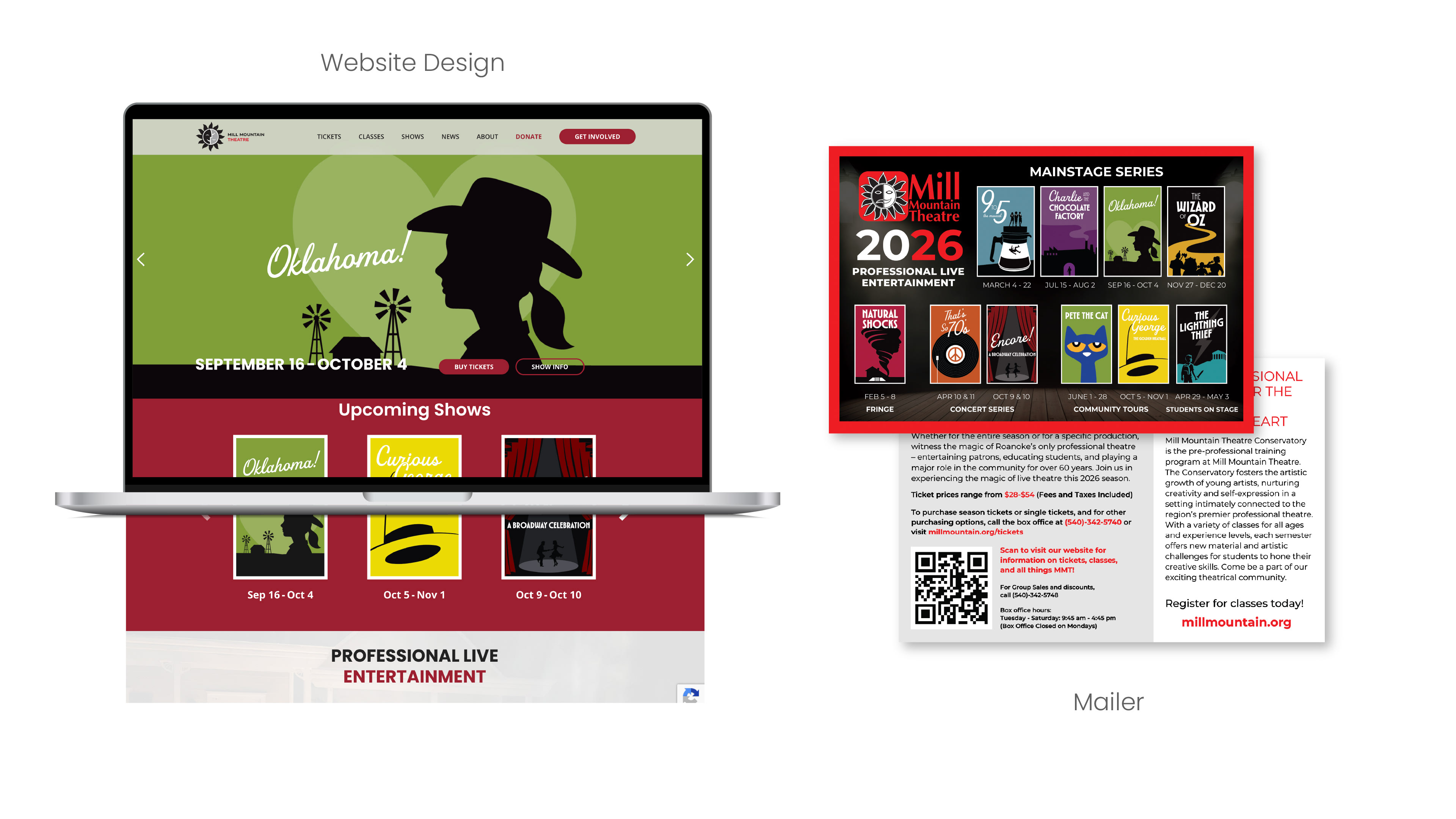
I was tasked with designing a new website to showcase the 2026 season in a way that
followed the same design principals laid out in the series redesign.
followed the same design principals laid out in the series redesign.
Hannah Escobedo Art Director, Illustrator, UIUX Designer
Kym Ricketts Creative Director
Eujenya Shulim Illustrator
Adam Thompson Web Developer
Kym Ricketts Creative Director
Eujenya Shulim Illustrator
Adam Thompson Web Developer